MM · Branding
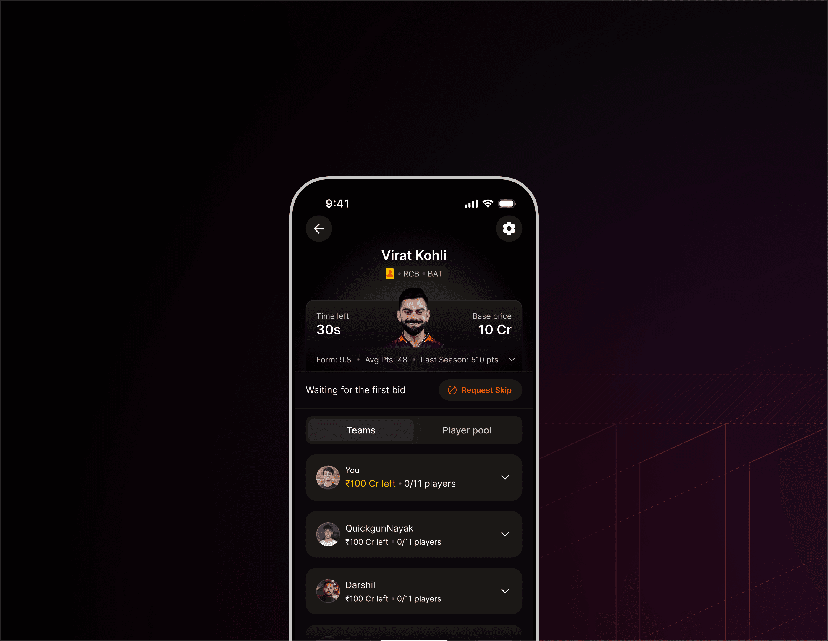
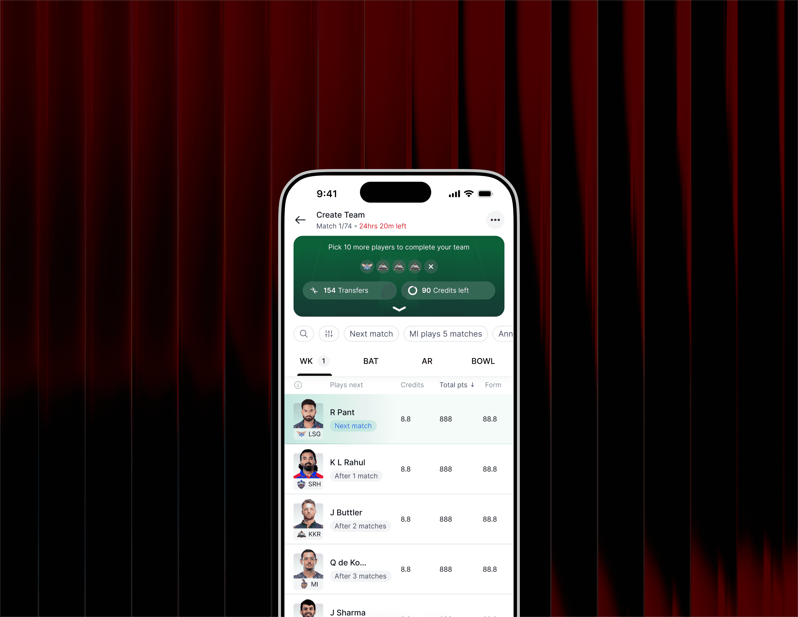
Brand identity for Dream11’s season-long fantasy format, designed to signal persistence, ownership, and long-term progression instead of instant wins.
00
problem
Manager Mode was Dream11’s first season-long fantasy format, fundamentally different from daily contests. Existing brand cues across the platform were optimized for instant gratification, quick rewards, and short-term outcomes. This created a mismatch. A mode built around long-term strategy, patience, and sustained engagement was visually and emotionally framed like a quick-play product. The challenge was to design an identity that could communicate commitment, control, and progression while still feeling native to the Dream11 ecosystem.
solution
I designed a brand system for Manager Mode that emphasized persistence over hype and ownership over chance. The identity was intentionally restrained, modular, and scalable, built to live across months of gameplay rather than moments. The system balanced Dream11’s master brand with a distinct sub-brand language that could evolve season after season without losing recognition or authority.
Designing an identity for long-term play
Manager Mode was not just another fantasy format. It was a mindset shift. Unlike daily contests, users were expected to think like managers, plan transfers, track form over weeks, and live with the consequences of their decisions.
This demanded a brand that felt stable, composed, and enduring. Loud, celebratory visuals risked misrepresenting the experience. Instead, the identity needed to quietly reinforce seriousness, progression, and control from the first touchpoint.
The branding direction was anchored around one core idea: persistence. Everything from the logo structure to motion behaviour was designed to feel deliberate rather than reactive, signalling that this was a mode for committed players.
Design Principles
Persistence over peaks
Visual restraint ensured the brand aged well across a long season.
Modularity
The system needed to scale across formats, surfaces, and future extensions.
Progression
Visual rhythm and hierarchy reflected gradual growth instead of instant payoff.
Authority
The identity had to feel confident without relying on loud cues or gimmicks.
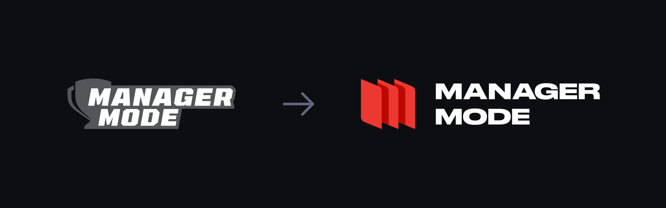
Identity Evolution
The previous direction leaned heavily on tournament-style energy and short-term excitement. For Manager Mode, those cues were intentionally stripped back.
The evolved identity focused on:
A tighter, more disciplined mark
Reduced visual noise
Stronger emphasis on structure and repetition
This shift aligned the brand with the mental model of managing a team over time rather than chasing quick wins.
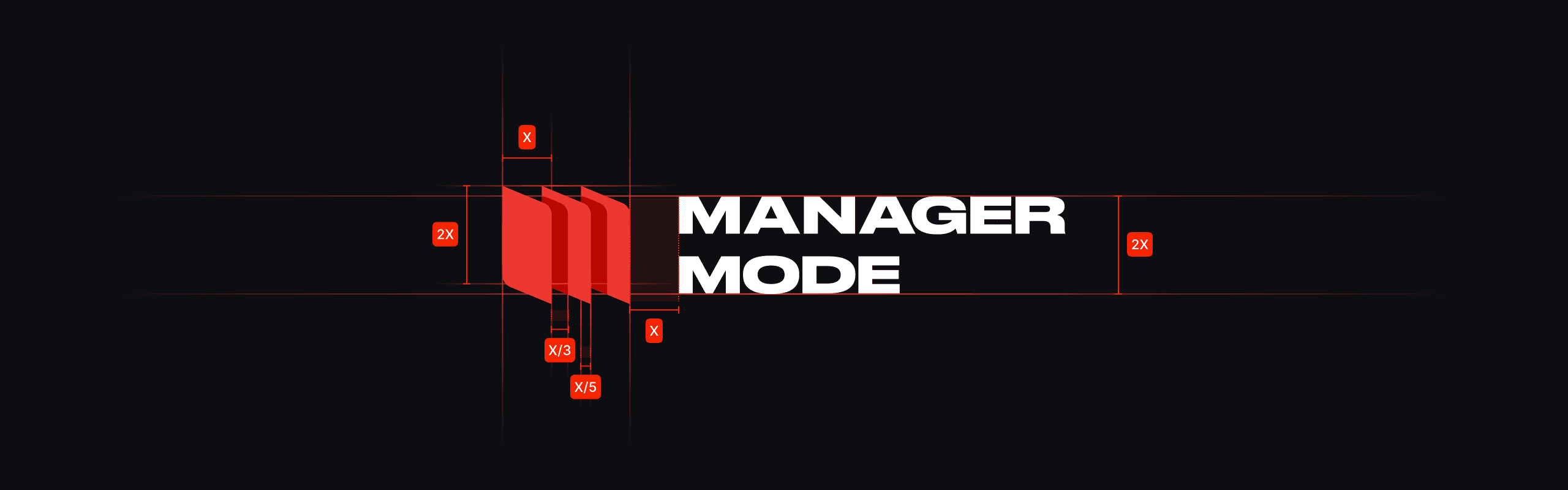
Logo System
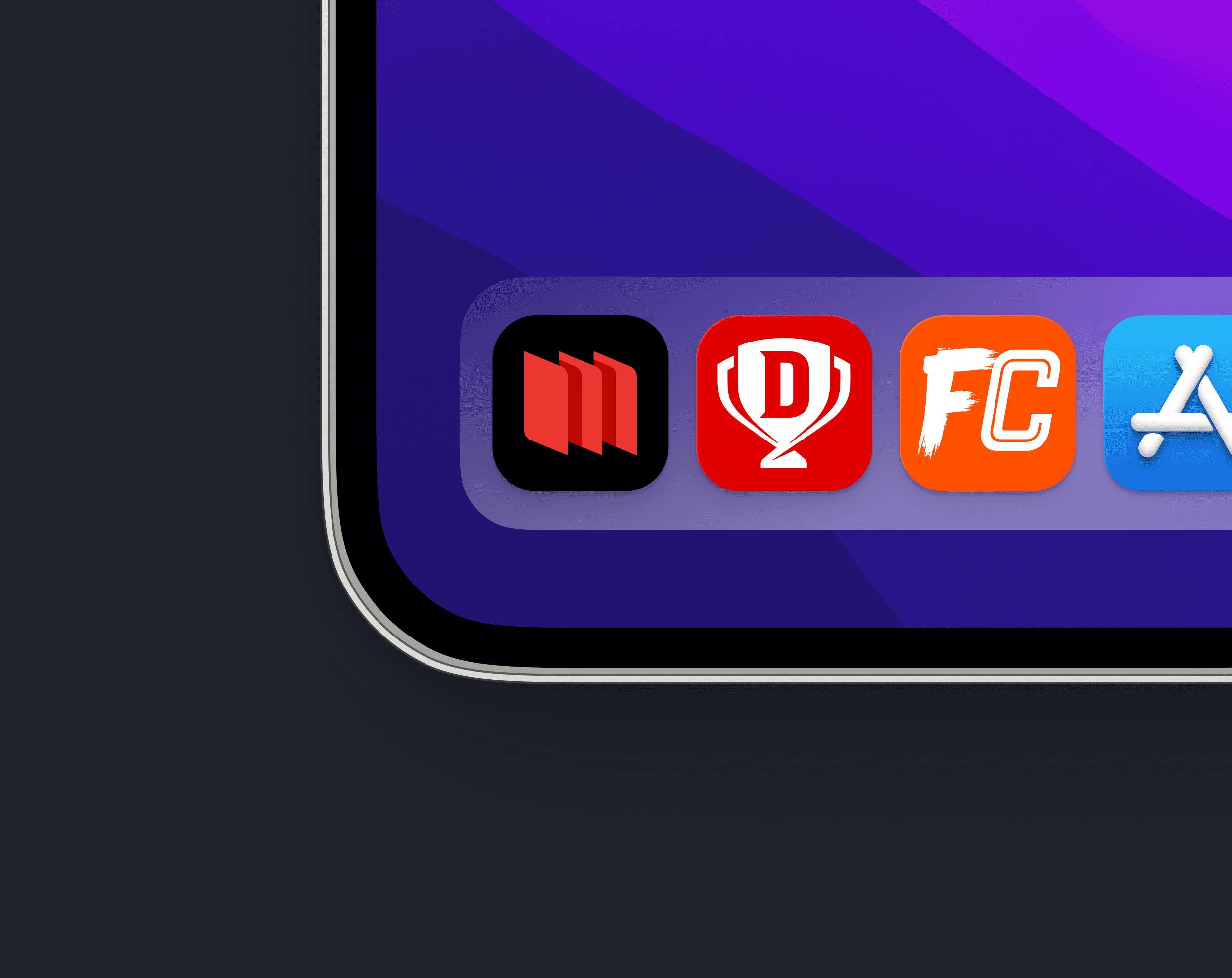
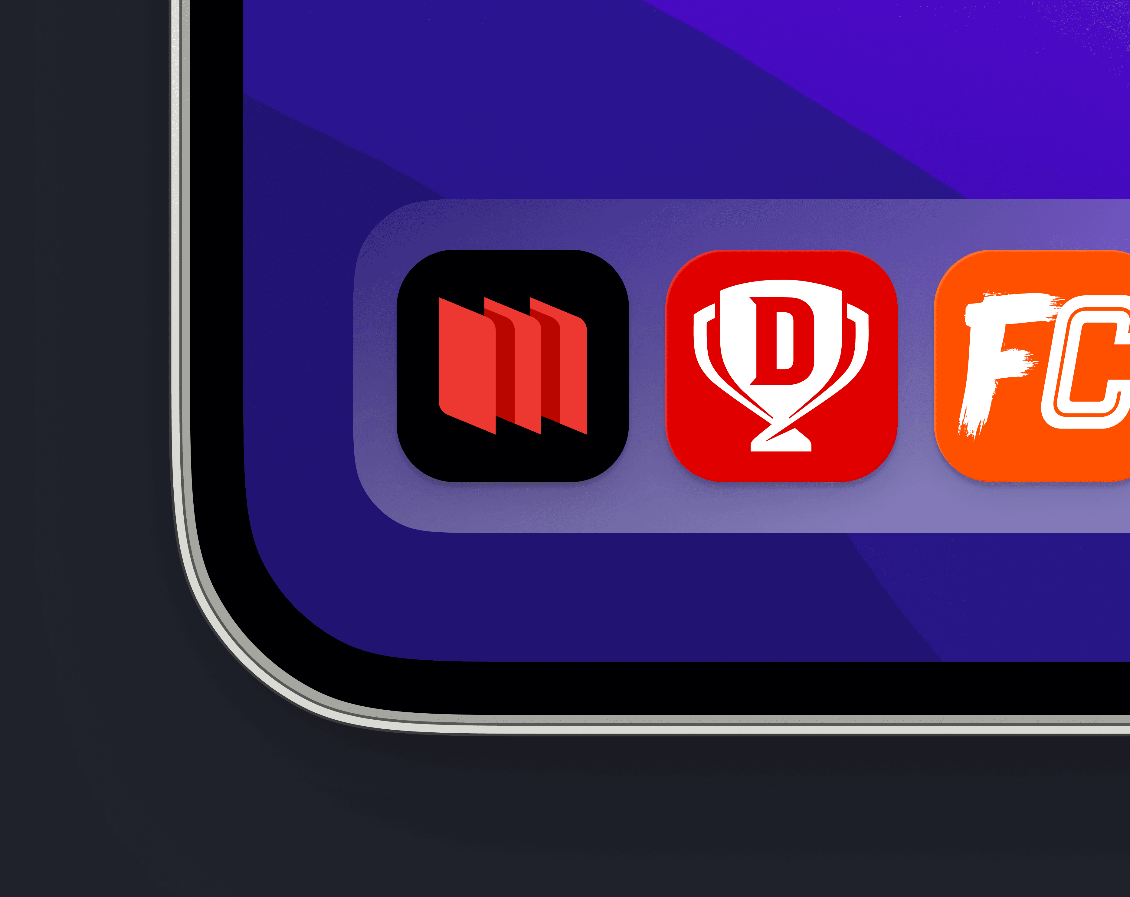
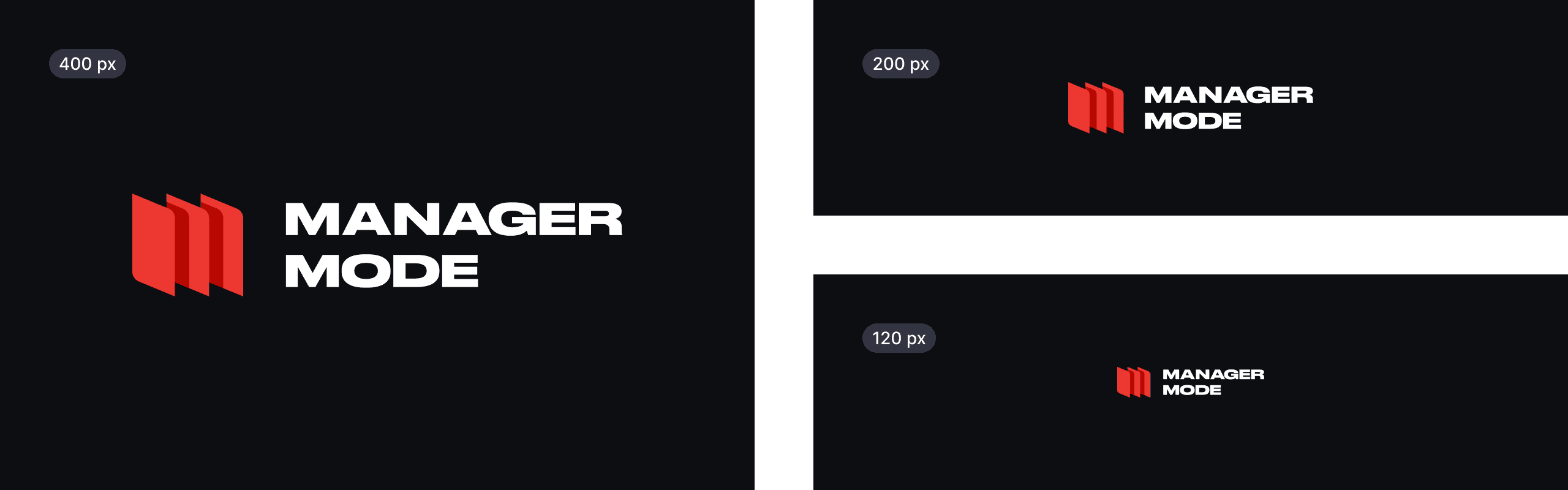
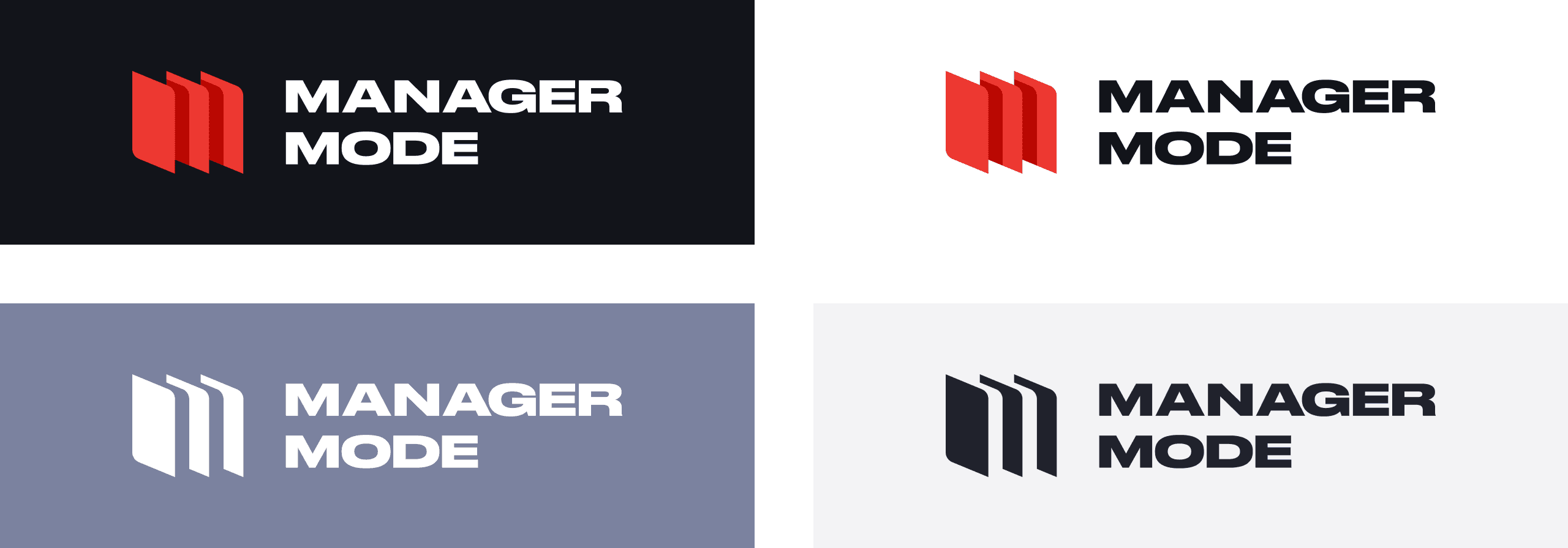
The Manager Mode logo was designed as a modular mark that could adapt across surfaces without losing clarity.
Key considerations:
High legibility at small sizes
Strong silhouette for digital environments
Flexibility for future seasonal variants
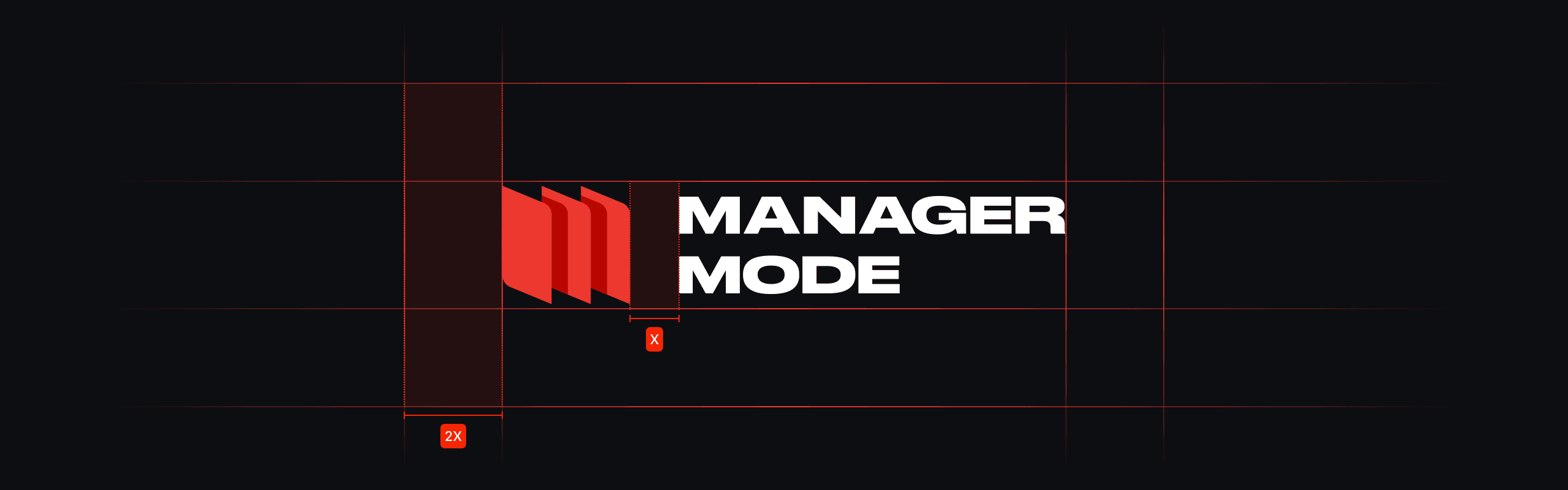
Spacing, scale, and clear space rules were defined to maintain consistency across in-app usage, marketing, and motion.
Applications and Usage
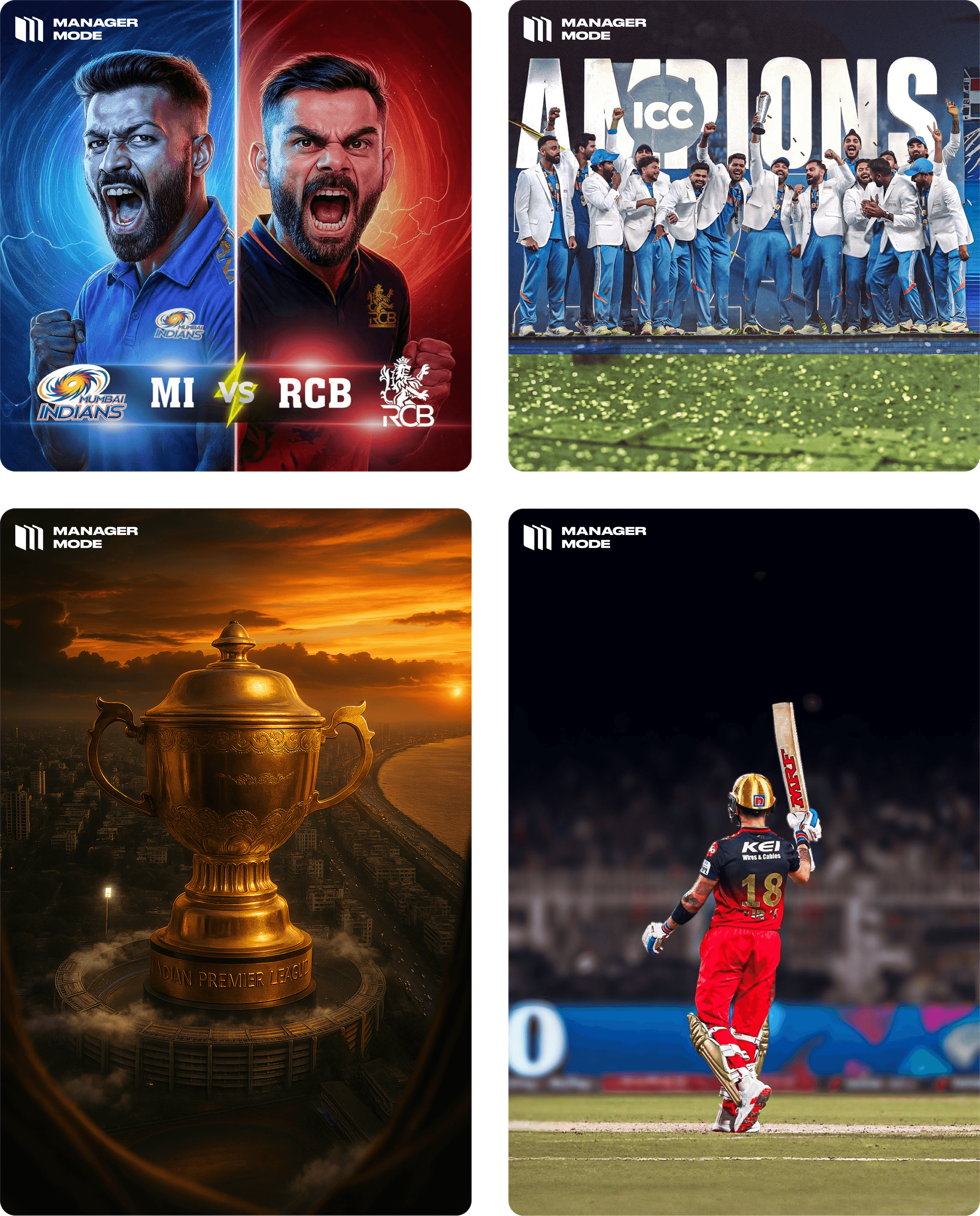
The identity was tested across:
In-app surfaces
Promotional creatives
Editorial-style sports photography
Motion and pattern systems
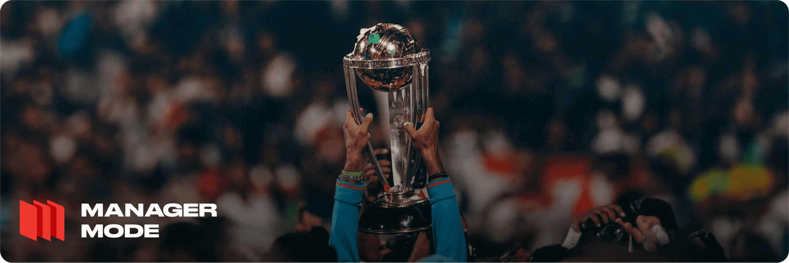
Photography direction leaned toward moments of control, anticipation, and achievement rather than pure celebration. This helped reinforce the idea that success in Manager Mode is earned gradually.
Brand Pattern and Motion
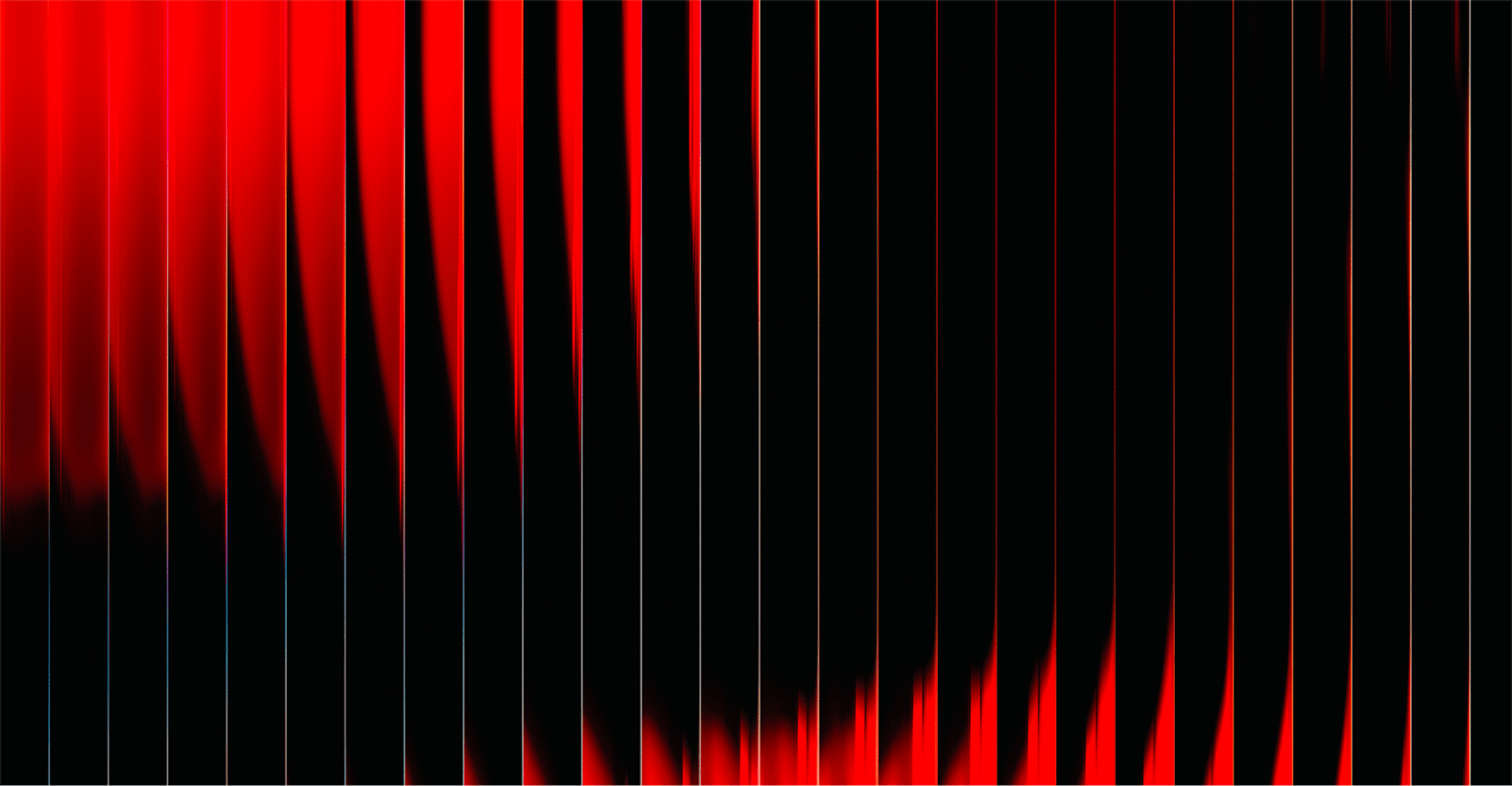
A subtle pattern system was created to add depth without visual overload. Motion behaviour was intentionally slow and controlled, mirroring the pace of long-term decision making rather than instant feedback loops.
Reflection
This project strengthened my approach to branding as a product system rather than a visual layer. Designing for long-term engagement required resisting short-term excitement and prioritising clarity, restraint, and longevity.
It reinforced the importance of aligning brand behaviour with user mindset, not just product features.
year
2025
timeframe
16 days
tools
Figma
category
Branding and Identity
01
Winning moments